
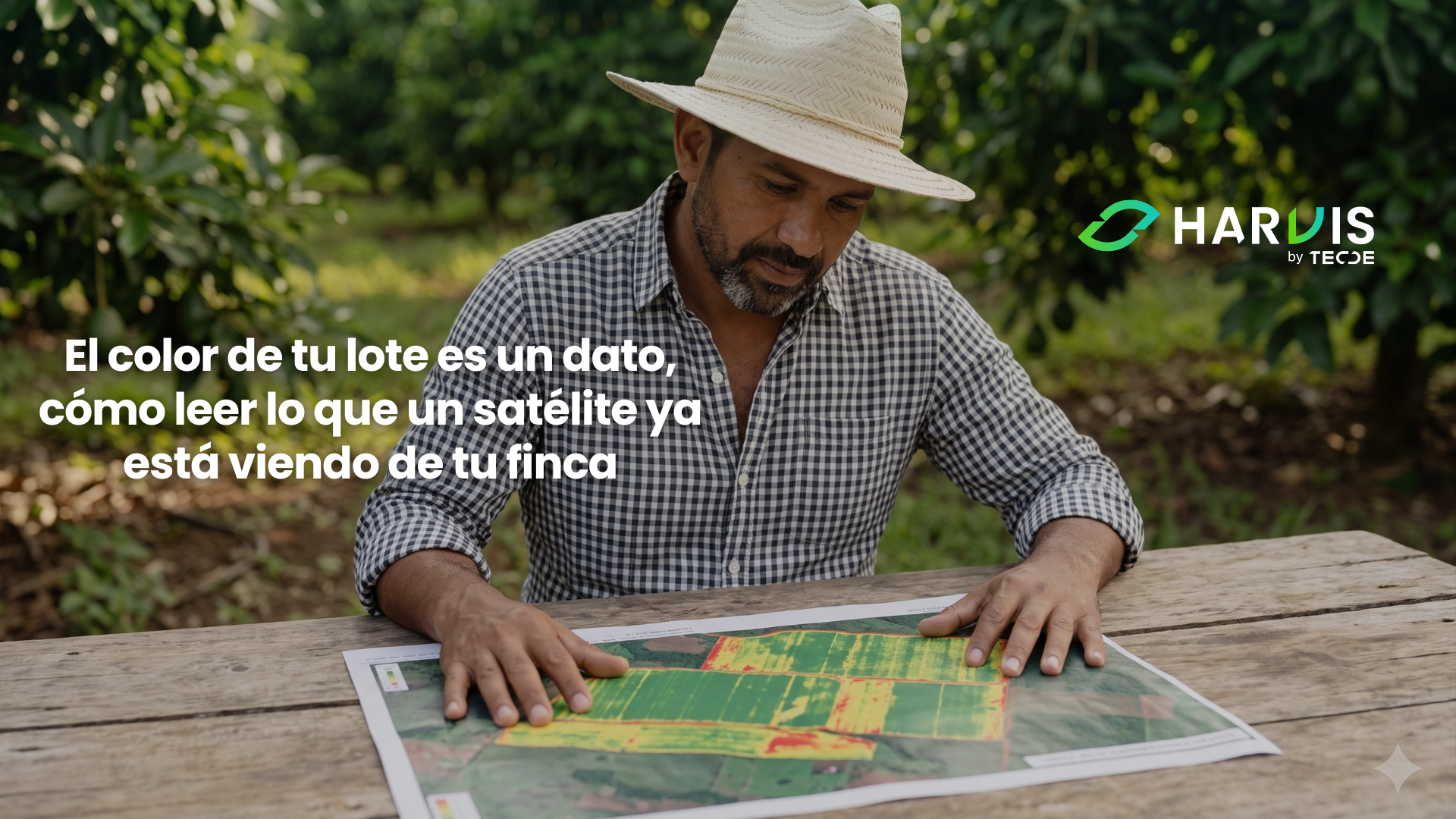
A crop that looks uniformly green from the road may be losing yield on a third of its surface without anyone noticing. The human eye works with three color channels, automatically adapts to brightness, and poorly compares two points separated by two hundred meters, so the variability that exists within the same lot almost always escapes it. What you register when you walk through the crop is a visual average, and the average is precisely what hides the problem. A sensor orbiting over your farm does not have that limitation because it measures bands of the spectrum that your eyes do not capture, because it measures all points with the same standard, and because it keeps a record so you can compare today's lot with the same lot from three months ago.
Last season, we worked through five deliveries on water, calculating the crop's demand, reviewing how much actually reaches the root, identifying the windows where restrictions improve the margin, and learning to measure in real-time what the soil has. All that measurement shares a characteristic that is worth recognizing, and that is that it is punctual; a buried sensor measures one point, and however well located it is, it does not represent the five hectares that surround it. This season changes the scale of the problem. We will talk about technologies that measure the entire lot without burying anything, satellites, drones, and the models that convert those images into usable information, and this first tour is what gives you the criteria to know what you can ask of an image and what you cannot.
The Light Your Crop Reflects, and the Part of It That Your Eyes Do Not Register
Everything that follows rests on a simple physical fact. Sunlight reaches the leaf, part is absorbed, another is transmitted, and another is reflected back up, and the proportion that is reflected at each wavelength is not the same. Chlorophyll absorbs strongly in the blue and red, because that is the energy it uses for photosynthesis, and reflects relatively more in the green, which is why a healthy leaf appears green to you. Up to that point, your eye can see.
The interesting part begins just after the visible red. In the near-infrared, a band that the human eye does not perceive at all, a healthy leaf reflects a lot because the internal structure of the mesophyll disperses that radiation instead of absorbing it. When the leaf loses turgor, when the cellular structure begins to collapse, or when the plant reduces its activity due to stress, that reflection in the infrared drops, and it drops before the visible green changes tone. That delay is the entire foundation of agricultural remote sensing because it means that there is a measurable signal of deterioration that appears while the crop still looks good.
Between red and near-infrared, there is a narrow transition zone where reflectance rises abruptly, and that band is known as the red edge. Its exact position shifts according to the chlorophyll content of the canopy, so a sensor capable of measuring there provides information about the nutritional and health status that the visible bands cannot resolve. Studies on chlorophyll content estimation with Sentinel-2 and hyperspectral imagery in open canopies show that red edge bands provide additional sensitivity precisely in the ranges where classic indices begin to lose resolution. Keep that idea in mind because it will return two sections later.
From Pixel to Index: What NDVI Really Measures and What It Does Not
A satellite does not deliver crop health; it delivers reflectance numbers by band and by pixel. Vegetation indices are formulas that combine those bands to produce a single value that is easier to interpret, and the most widely used by far is the normalized difference vegetation index, NDVI, which compares near-infrared against red and normalizes the result between minus one and one.
Its logic is transparent. A dense and active canopy reflects a lot of infrared and absorbs a lot of red, so the index rises; bare soil, dry stubble, or a deteriorated canopy reflect more evenly in both bands, and the index drops. In practical terms, NDVI behaves as a good indicator of how much photosynthetically active biomass is in that pixel, and that is why it works well to delineate where the crop ends, to detect planting failures, to see an area that is lagging behind, and to track the evolution of a lot throughout a campaign.
It is also important to be clear about what it is not. NDVI is not a yield meter, does not distinguish the cause of a problem, and does not tell you if that low area is like that due to lack of water, nutritional deficiency, compaction, a pest, or simply because there are fewer trees per hectare there. A value of 0.72 means nothing by itself; it means something when you compare it against the rest of your lot in the same image, or against that same point in last month's image. A global systematic review of vegetation indices documents hundreds of proposed formulas precisely because none solves all cases, and because each was designed to correct a specific limitation of the previous ones. The practical conclusion that emerges is that the index is a comparison tool, not a diagnosis.
When Green Saturates: The Limit That Almost No One Warns You About
Here is the limitation that matters most for the crops of this audience and that rarely appears in commercial conversation. NDVI loses sensitivity when the canopy becomes dense. As the leaf area index grows above three, the relationship between infrared and red stops responding to additional increases in biomass, the index stagnates near its ceiling, and two areas with very different states begin to return almost identical values. This behavior is known as saturation and is well documented, both in specific evaluations of the saturation property of indices derived from Sentinel-2 in mixed ecosystems and in recent works dedicated to mitigating it through modified indices that amplify variation within the high range.
Read it in terms of the farm because the problem is not theoretical. An adult coffee tree in production, a mature citrus with a closed canopy, or an eight-year-old avocado in full vegetation are precisely in the range where NDVI flattens. You will look at the map, see it uniformly intense red or dark green depending on the palette you use, and conclude that the lot is uniform when what happened is that the instrument ran out of resolution to distinguish. In young annual crops, NDVI shines; in adult perennial fruit trees, it should be treated with caution.
Alternatives exist and are not expensive because they are in the same free images. Indices built on red edge bands, such as NDRE and chlorophyll indices, continue to respond when NDVI has already saturated because the red edge signal depends on chlorophyll content and not just on the amount of leaf. Their advantage becomes more noticeable precisely under medium and high biomass conditions, which is where an adult fruit tree lives. The operational recommendation is simple: if your crop is perennial and has a closed canopy, do not base your reading on a single index, and give more weight to those that use red edge.
Looking at Your Entire Lot, Not Just Where You Walk
When was the last time you walked through one hundred percent of your planted area and not just the paths you always enter? Most management decisions are made based on the fraction of the farm that one frequently walks on, and that fraction is rarely representative. Harvis helps you keep track of what happens lot by lot, cross-referencing what the images show with your application, irrigation, and harvest history, and turning a low area on the map that appears in the index into a specific work order for the week. Message us on WhatsApp, and let's see together what the satellite is seeing of your farm.
The Three Resolutions You Are Choosing Without Knowing It
When someone offers you satellite images, they are making three decisions for you that are worth understanding because they are a trade-off, and you cannot maximize all three at the same time.
Spatial resolution is the size of the land represented by each pixel. The Sentinel-2 mission of the Copernicus program delivers thirteen spectral bands with pixel sizes of ten, twenty, and sixty meters depending on the band, with the blue, green, red, and near-infrared bands at ten meters and the red edge and shortwave infrared bands at twenty. Landsat, from the joint program of the U.S. space agency and the geological service, operates at thirty meters in its multispectral bands. Now translate that to your crop. A ten by ten meter pixel is one hundred square meters; in an avocado planted at seven by seven, that pixel contains two trees, the streets between them, the weeds, and bare soil. What the sensor reports to you is the mix of all that, and that is the problem of the mixed pixel, well documented in fruit trees, where the mix of canopy, soil, grass, and shade complicates the estimation of biophysical variables and has motivated the development of specific background corrections. In crops with continuous canopies, the mix matters little; in orchards with wide streets, it is the main source of error.
Temporal resolution is how often the satellite returns. The Sentinel-2 constellation operates with two satellites in the same orbital plane offset by one hundred eighty degrees, which gives a revisit of five days at the equator; the Sentinel-2C satellite was launched in September 2024 and became operational replacing Sentinel-2A in January 2025. By combining Landsat and Sentinel-2 in harmonized products, the average revisit drops to around three days, and that is the input used by the most ambitious works of dense time series.
Spectral resolution is how many bands it measures and how narrow they are. Here lies the difference between being able to calculate only NDVI and being able to calculate red edge indices, canopy moisture, or cover discrimination. A drone with an RGB camera has extraordinary spatial resolution and poor spectral resolution; a public satellite has the opposite. Neither wins in everything, and that is why the correct question is never which is better but which answers the question you have.
The Tropical Cloud: The Obstacle That No Catalog Mentions
All of the above assumes that the image can be used, and in the tropical strip, that assumption often fails uncomfortably. An optical sensor does not see through clouds, nor through their shadow, so the nominal revisit of five days is a promise of the satellite's pass, not a promise of a usable image.
A study specifically dedicated to the limitations of cloud cover for optical remote sensing in agricultural areas of South America quantified the phenomenon with fifteen years of observations. Between September and November, sixty-eight percent of South American cropland has cloud frequency between forty and sixty percent; between December and February, the concentration is distributed between the classes of forty to fifty and seventy to eighty percent; and the work concludes that optical monitoring of summer crops is limited in several of the main producing regions. Read it in terms of the farm because it means that at the time of year when you most urgently need to see the crop is when you will get the least clean images, and planning a monitoring scheme with weekly revisit in a humid tropical zone is planning on an assumption that will not be fulfilled.
There are three ways to coexist with this, and all three are legitimate. The first is to work with temporal composites, adding several dates into a single image that takes the best available value from each pixel in the window; you lose precision in the exact date and gain continuity. The second is to loosen the accepted cloudiness threshold and mask the affected areas instead of discarding the entire scene, keeping in mind that with high cloudiness, index values become unreliable. The third is to incorporate radar. Synthetic aperture sensors, such as those from the Sentinel-1 mission, emit their own signal in microwaves and penetrate clouds, thus providing guaranteed observation even though they measure a different property, the roughness and moisture content of the surface instead of color. The literature on long series combining optical and radar acquisitions over agricultural surfaces shows that complementarity works, and recent works have advanced in reconstructing optical information under clouds from radar using deep learning. For an individual farm, the practical reading is that radar does not replace your vigor map but does prevent you from going blind for six weeks.
From Map to Management Zone, and How to Start Without Spending a Penny
A pretty image does not change anything. What changes management is converting that image into a division of the lot into zones that are treated differently, and that step is simpler than the industry usually presents.
The reasonable procedure starts by accumulating images. Download the free historical series of your farm from the last two or three years, calculate an index for each clean date, and keep only the dates that correspond to the phenological stage you are interested in comparing, because mixing a flowering image with a post-harvest one tells you nothing. With that stack of images, instead of looking at a single date, calculate the average of each pixel over time and also its variability. The zones that consistently appear low on many different dates are areas with a structural problem, of soil, drainage, compaction, or density; the zones that fluctuate a lot between dates are areas with a management problem or a specific event. That distinction between what is stable and what is variable is what turns a map into a decision, and it is the approach followed by works that analyze patterns of yield stability with multi-year Sentinel-2 series to identify areas of high, medium, low, and unstable productivity.
The second step, and this is non-negotiable, is to walk the zones before acting on them. A map tells you where to look, never what to find. Take the lowest and highest zones, walk through both, count trees, look at the soil, take leaf and soil samples in each, and compare. In half the cases, you will discover that the difference has an explanation that no image would have given you, and that verification is what gives value to the rest of the exercise. The third step is to treat differently what is different, adjusting doses, density, or irrigation scheduling by zone, and recording what you did in each to evaluate it the following campaign.
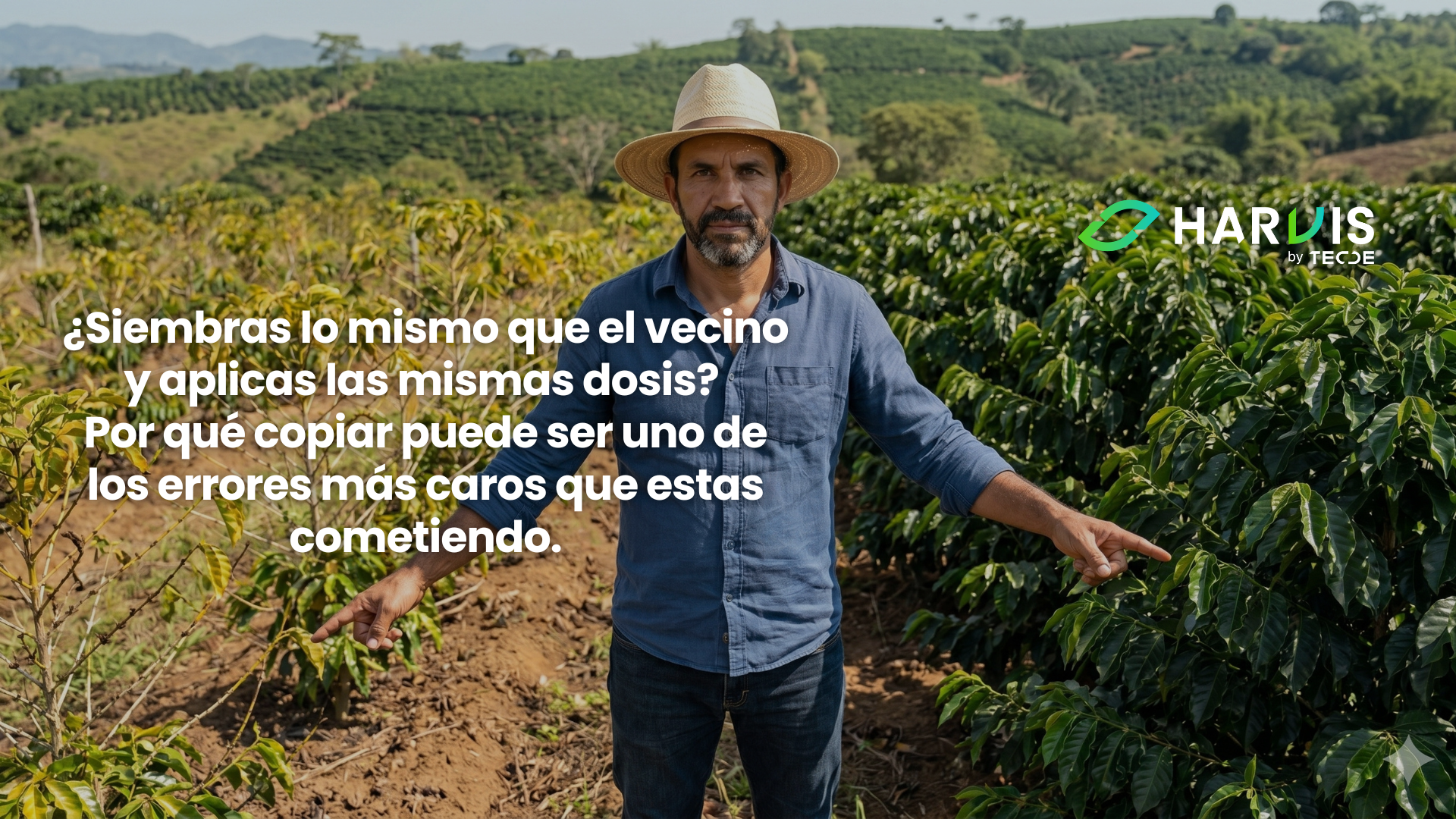
As we already addressed in our blog "Do You Plant the Same as Your Neighbor and Apply the Same Doses?", which you can read here, the variability within your own farm is as great as that which exists between neighboring farms, and treating a lot as a homogeneous unit is a decision that costs money every year; what remote sensing adds to that argument is that you can finally see that variability drawn on a map instead of intuiting it.
Learning to Look Before Learning to Buy
There is a curious asymmetry in this topic. Public satellite imagery is free, has existed for over a decade, covers your farm every few days, and remains the most underutilized technological input in Latin American agriculture, while enthusiasm is invested in much more expensive tools that solve smaller questions. The obstacle was never the price; it was the interpretation.
What you can do starting Monday does not require buying anything. Download the historical series of images from your farm from the last two years, keep the dates without clouds in the phenological stage that matters to you, calculate an index, and look at the average and variability of each point. If your crop is perennial and has a closed canopy, do not rely solely on NDVI and add a red edge index. Remember that each ten-meter pixel contains trees, streets, and soil, and that in open orchards, that mix is your main source of error. Expect to lose whole weeks due to cloudiness during the critical time and plan with composites instead of individual dates. And above all, walk the zones before deciding on them because the map tells you where to look, and the diagnosis remains yours. A producer who does those five things during a campaign is better prepared for any conversation about technology than one who bought a service without understanding what they are looking at.
References Consulted
- Chlorophyll content estimation in an open-canopy conifer forest with Sentinel-2A and hyperspectral imagery in the context of forest decline. PMC. https://www.ncbi.nlm.nih.gov/pmc/articles/PMC6472624/
- A global systematic review of the remote sensing vegetation indices. (2025). International Journal of Applied Earth Observation and Geoinformation / ScienceDirect. https://www.sciencedirect.com/science/article/pii/S1569843225002079
- Evaluation of the saturation property of vegetation indices derived from Sentinel-2 in mixed crop-forest ecosystem. Spatial Information Research, Springer. https://link.springer.com/article/10.1007/s41324-020-00339-5
- Mitigating NDVI saturation in imagery of dense and healthy vegetation. (2025). ISPRS Journal of Photogrammetry and Remote Sensing. https://www.sciencedirect.com/science/article/abs/pii/S0924271625002394
- Agencia Espacial Europea (ESA). Copernicus Sentinel-2, facts and figures. https://www.esa.int/Applications/ObservingtheEarth/Copernicus/Sentinel-2/Factsandfigures
- Copernicus Data Space Ecosystem. Sentinel-2 documentation. https://documentation.dataspace.copernicus.eu/Data/SentinelMissions/Sentinel2.html
- Reducing background effects in orchards through spectral vegetation index correction. International Journal of Applied Earth Observation and Geoinformation. https://www.sciencedirect.com/science/article/abs/pii/S0303243414001731
- 6 Years of SAR (Sentinel-1) and Optical (Sentinel-2, Landsat-8) Acquisitions over Agricultural Surfaces. (2026). Remote Sensing, MDPI. https://www.mdpi.com/2072-4292/18/5/790
- Dense Time Series of Harmonized Landsat Sentinel-2 and Ensemble Machine Learning to Map Coffee Production Stages. (2025). Remote Sensing, MDPI. https://doi.org/10.3390/rs17183168
- Prudente, V. H. R., et al. Limitations of cloud cover for optical remote sensing of agricultural areas across South America. Remote Sensing Applications, Society and Environment / ScienceDirect. https://www.sciencedirect.com/science/article/abs/pii/S2352938520302615
- Copernicus Sentinel-2C Radiometric Calibration and Validation Status. (2026). Remote Sensing, MDPI. https://www.mdpi.com/2072-4292/18/9/1387
- Assessment of yield stability patterns using Sentinel-2 over a 7-year period. (2025). Geocarto International, Taylor & Francis. https://www.tandfonline.com/doi/full/10.1080/10106049.2025.2532529
- CloudBreaker, breaking the cloud covers of Sentinel-2 images using multi-stage trained conditional flow matching on Sentinel-1. (2026). ScienceDirect. https://www.sciencedirect.com/science/article/pii/S2666017226000295
- Sentinel-2 for Crop Yield Estimation, A Systematic Review. (2026). https://arxiv.org/pdf/2603.23779
- Orchard plantation mapping using remote sensing phenological feature fusion and interpretable ML algorithms. (2026). Ecological Informatics / ScienceDirect. https://www.sciencedirect.com/science/article/pii/S1574954126000348
- Integrating NDVI and Multisensor Data with Digital Agriculture Tools for Crop Monitoring in Southern Brazil. AgriEngineering, MDPI. https://www.mdpi.com/2624-7402/8/2/48